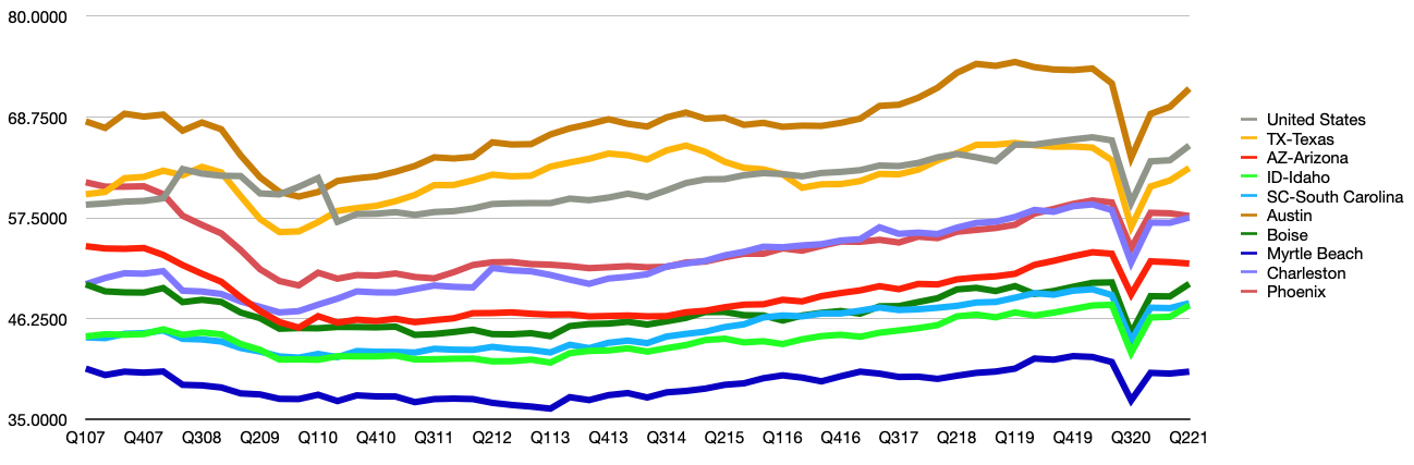
Average Home Values Since 2007
How has the housing market performed since the 2007 financial crisis?
Average Home Values Since 2007
How has the housing market performed since the 2007 financial crisis?
The US economy has come a long way since the 2007-2008 financial crisis. State and local economies across the country faced their own unique crises dealing with the housing market collapse. We took a look at STI: PopStats™ numbers to see what other economic factors were affected by the collapse and how they’ve changed since then.
The Housing Market
The subprime mortgage crisis of 2007, was a key contributor to the global financial crisis that followed. Property values across the country hit rock bottom. But not everywhere.
We took a look at PopStats data since 2007 and it clearly shows that some areas were hit harder than others. Some states’ housing markets hardly skipped a beat like Texas, North Dakota, Colorado, etc. While others took it much harder than others like West Virginia, Michigan, etc. See for yourself in this graphic:
Here’s another view of the data:
The following videos are visualizing population density (height) and average home value (color) by county. Each video shows a different view of the United States starting with the west, then central, and finally the east. Both average home value and population density have limits. The data is from Q1 of each year.
Some interesting locations to look at are Austin, Texas (Travis County), Southern Florida, and Minneapolis, Minnesota (Hennepin County).
WEST VIEW 2007-2021
CENTRAL VIEW 2007-2021
EAST VIEW 2007-2021
Taking A Closer Look
As we look at the communities under our scope, we’ll refrain from deriving conclusions as to the exact causes for the observed outcomes. Our expertise lies in generating accurate forecasts and estimates, not in providing this type of analysis, so we’ll leave it up to the reader to infer deeper insights.
The first market we’ll focus on is Austin. It has experienced unprecedented growth in almost every category. The next market we’ll showcase is Phoenix, which took a hard hit at the beginning of the recession, but has experienced a strong recovery. Lastly, we’ll look at Charleston, West Virginia, which didn’t move much at all during the entire 14 year period.
The Markets
Our approach to evaluating these three markets will be to explore their population, unemployment, housing, and GDP in 2007, 2012, 2016, and current-day (Q3 2021).
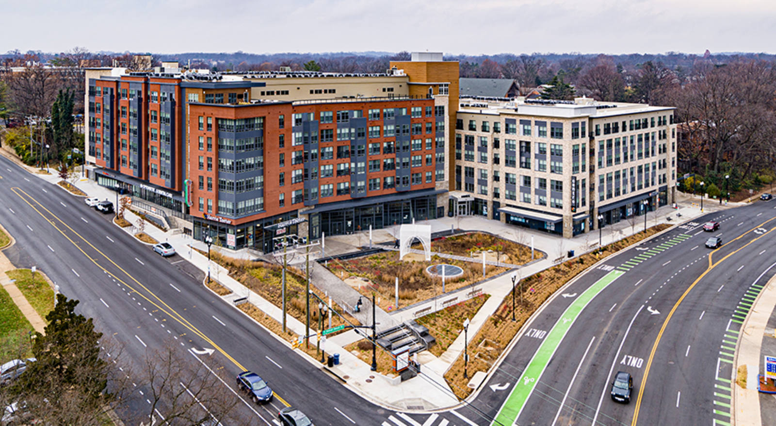
Austin
In 2007, the Austin market’s population was 1,412,264. At the same time, the city’s unemployment rate was 3.49%, the average home value was $202,964, and GDP running at $70,379.
Austin’s population has exploded over the past 14 years. It’s worth noting that unemployment has increased by 36% when compared to 2007, but unemployment increases many times are a sign of mobility and opportunity for job seekers.
Today, the difference for the highlighted fields is as follows:
- Population: +58%
- Unemployment: +36%
- Average Home Value: +169%
- GDP: +5.2%
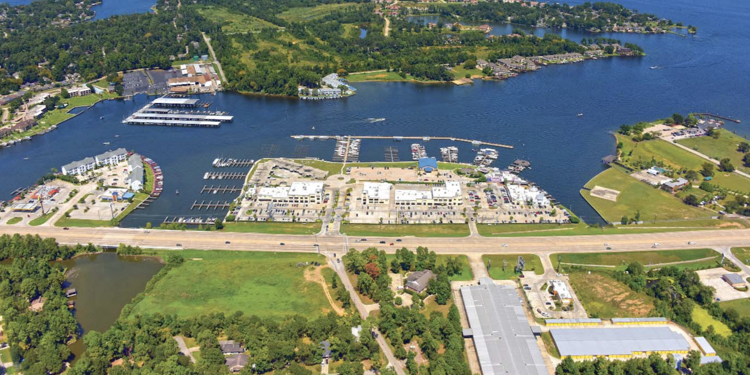
Phoenix
In 2007, the Phoenix market’s population was 3,830,898. At the same time, the city’s unemployment rate was 3.34%, the average home value was $360,952, and GDP running at $60,043.
An interesting insight to make about the data listed below is that Phoenix’s housing market was 78% more expensive than Austin’s in 2007. Then the Phoenix market appears to correct into 2012 where the two markets then became comparable. Going forward from 2012, both markets behave similarly.
Today, the difference for the highlighted fields is as follows:
- Population: +31%
- Unemployment: +99%
- Average Home Value: +70%
- GDP: -4.33%
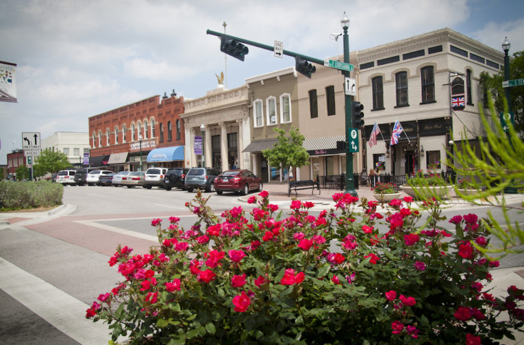
Charleston, WV
In 2007, the Charleston market’s population was 224,942. At the same time, the city’s unemployment rate was 4.17%, the average home value was $121,385, and GDP running at $51,503.
What’s most interesting about the Charleston, WV market, and why we chose to highlight it, is Charleston has a population decline. The only one with a population decline of the three markets we’ve highlighted. This market’s GDP still increased since 2007 despite a population decline.
Today, the difference for the highlighted fields is as follows:
- Population: -4.3%
- Unemployment: +30%
- Average Home Value: +25%
- GDP: +7.5%
Conclusion
When we look at the data for 2007, 2012, 2016, and 2021, we see more nuance as to how each market traversed the challenges it faced. Below is a spreadsheet with the variables we measured, listed by year:
Looking back at the past 14 years, we lived through a crisis that shook the foundation of our economy and begged the question as to whether the American dream of home ownership can remain accessible to all. Since then, many socio-political changes have taken place and we’ve seen the country bounce back and achieve record breaking levels of economic growth. For the past two years, we’ve been living through a global pandemic that has challenged every country in the world, and changed the way Americans view their work, and standard of living. The net effect of these massive changes are yet to be fully realized and quantified, but as always, our data will provide a clearer view of the past so we can better project the future.


