LandScape Segments Fueling Top Growth Markets
Let’s explore the groups responsible for driving economic vitality in the top growth markets in the United States
LandScape Segments Fueling Top Growth Markets
Let’s explore the groups responsible for driving economic vitality in the top growth markets in the United States
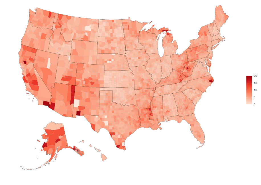
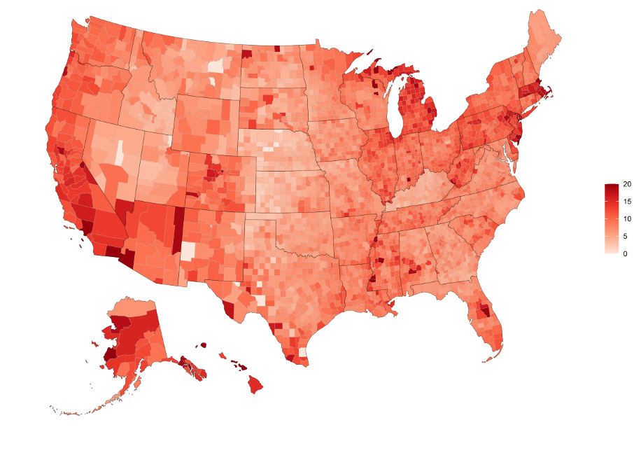
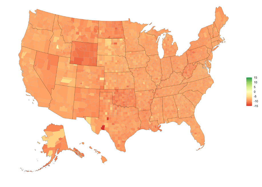
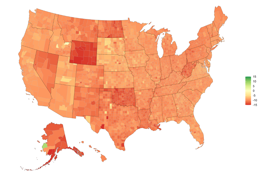
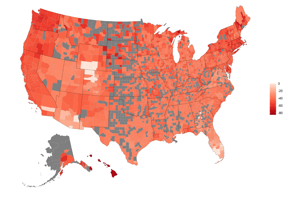
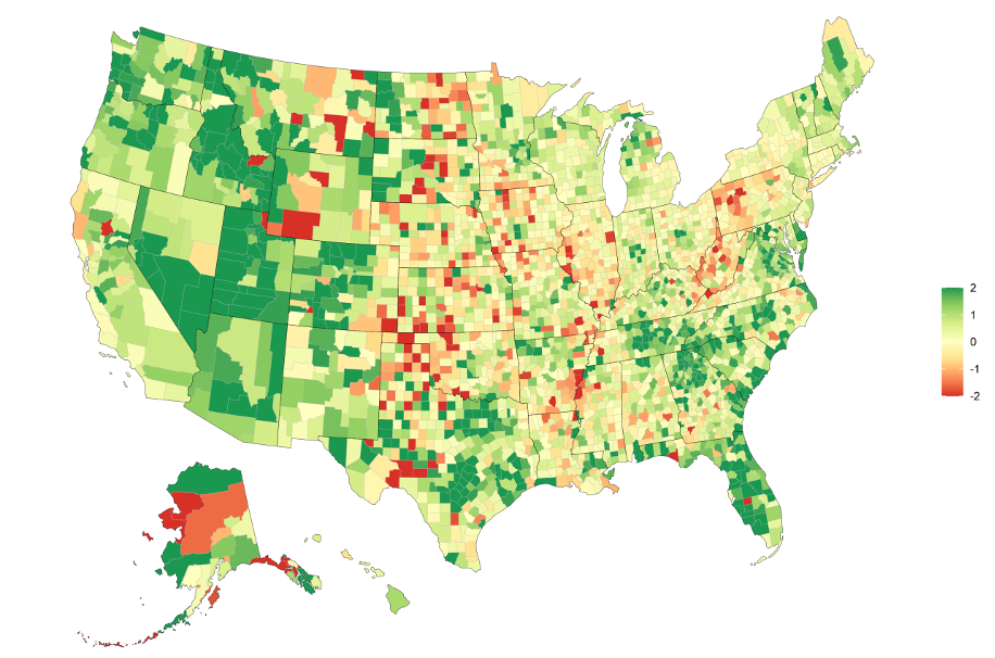
Earlier in 2021, we released our “Top Growth Markets” annual report. This report lists the 26 strongest markets in the United States. In those markets, there are segments of the population that are fueling this growth. We dive into the top 10 markets and determine which segments are responsible for their growth.
What are STI: LandScape™ segments?
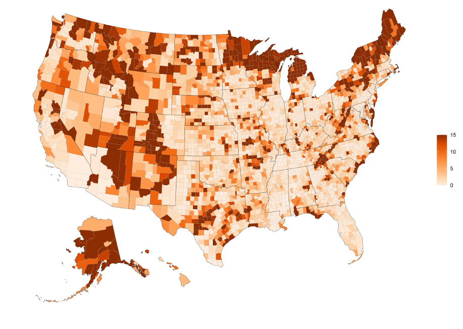
STI: Landscape™ is a lifestyle segmentation product that allows a marketer to identify their customer profile from 72 predetermined segments and to pinpoint their location across the U.S. All 72 segments are sorted into 15 categories. Lifestyle segments are determined by race, household type, age, income, and many other factors. Knowing customers’ unique lifestyle attitudes has numerous applications including site selection, marketing, merchandising, and so on.
Knowing what type of customer is in a market, and which ones are growing in an area, is a valuable insight into any untapped potential.
Segments Fueling the Top Markets
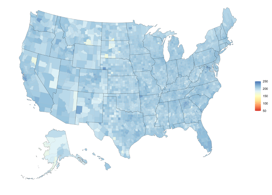
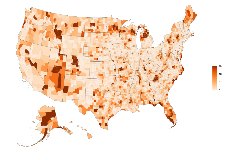
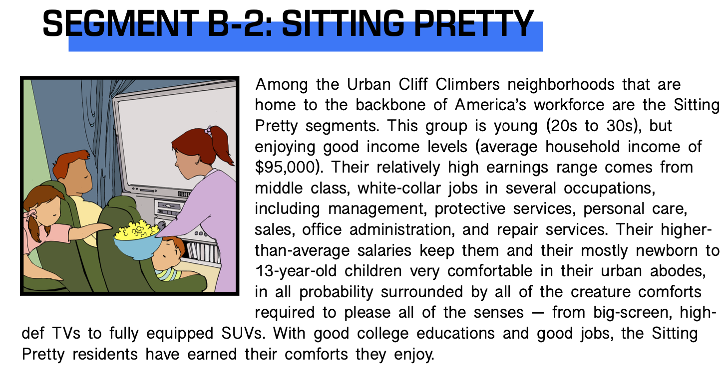
In the top 10 of the top markets report, there were a few segments that stood out. The first one was the Sitting Pretty segment. This segment appeared 6 times out of the 50 chances it got. The Sitting Pretty segment falls under our Urban Cliff Climbers category which are high-density neighborhoods that are mostly filled with families that work hard for their well-earned living. They’re a strong representation of the “working class.”
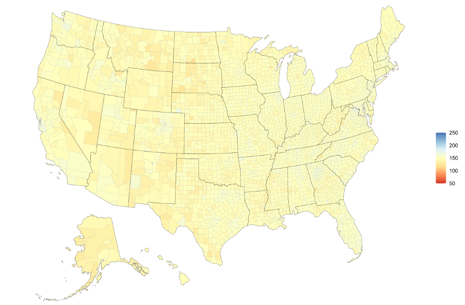
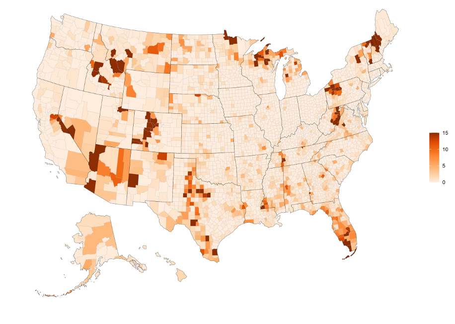
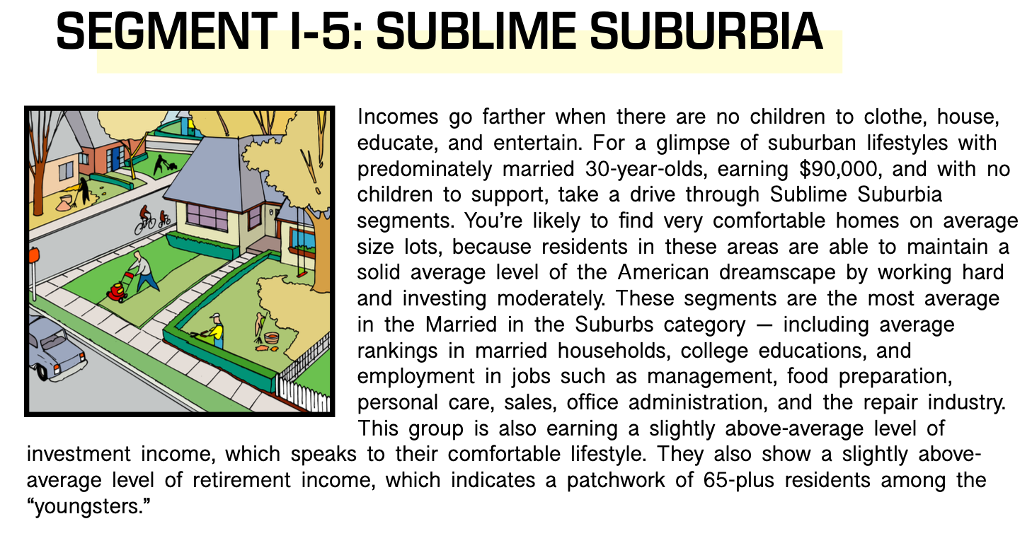
The segment that had the second-highest number of appearances is the Sublime Suburbia segment which appeared 5 times. This segment falls under the Married in the Suburbs category which includes 30-something suburbanites enjoying the fruits of the high-quality suburban lifestyles. They earn very good incomes and they mostly consist of married couples with children.
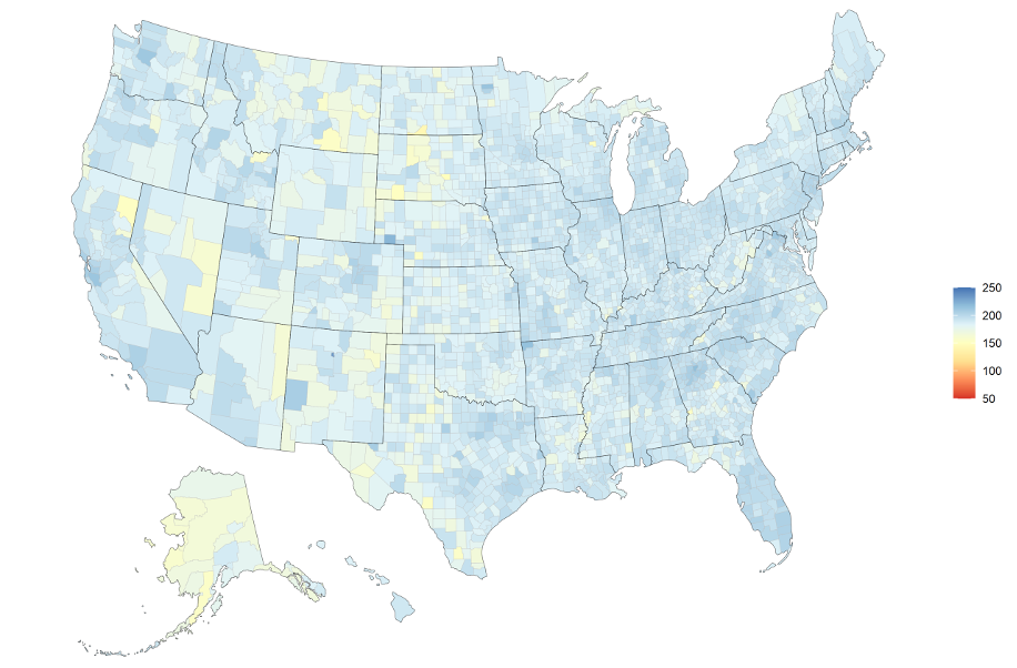
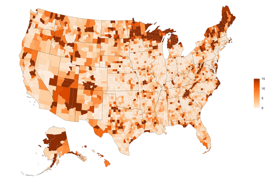
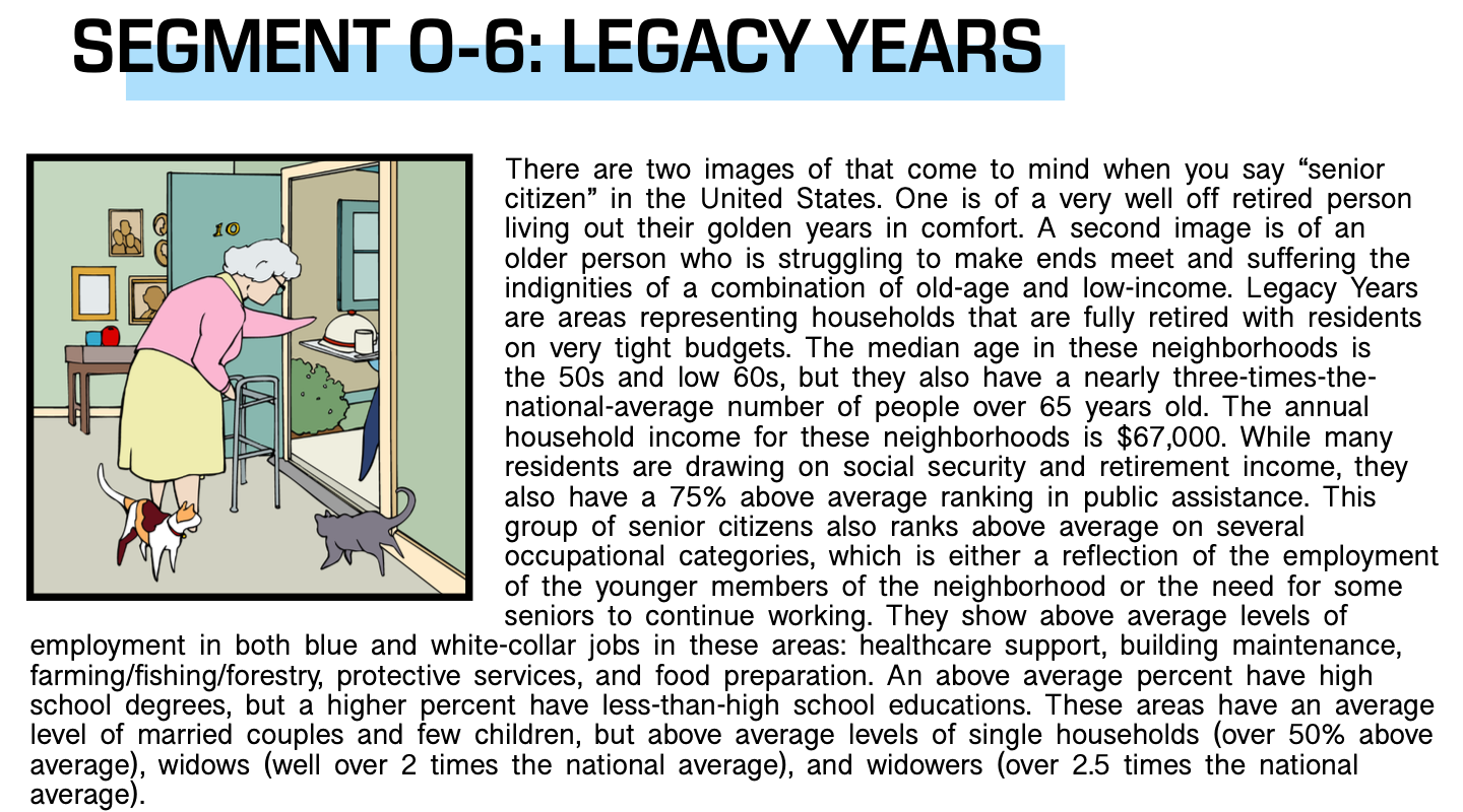
The segment with the third-highest, and our final segment spotlight, is the Legacy Years segment which appeared 4 times. Legacy years falls under the Specialties category in LandScape which are unique segments that don’t quite fit any other category. These neighborhoods generally host people that range in age of older 50s to early 60s.
As you follow along with the list, use this guide to help you better understand what type of neighborhoods are helping these markets grow. You can also click on each segment to get a more detailed definition. Reach out on the chat or here for detailed descriptions of all 72 segments.
The Segments:
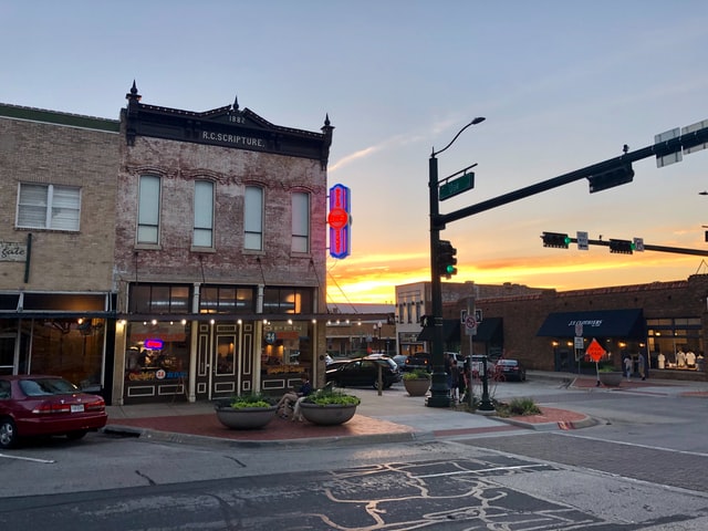
Austin, TX – The highest growth market from the 2021 report is Austin! The area referenced in the report comprises Travis, Hays, and Williamson counties.
The segments fueling the Austin growth are ranked as follows:
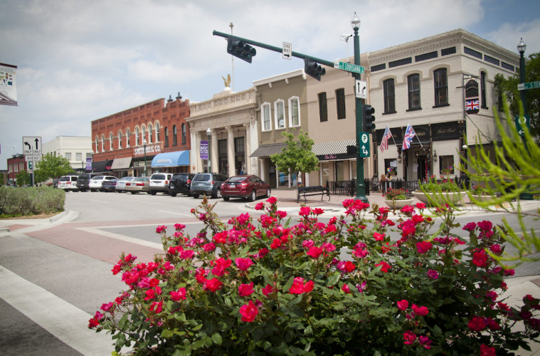
Boise, ID – coming up second in the fastest-growing markets is Boise! The counties encompassing this market are Ada, Boise, Payette, and Canyon county.
The segments fueling the Boise market are:
Charleston, SC – the second market in South Carolina claiming its spot on this list is Charleston. The counties included in this market are Charleston, Dorchester, and Colleton county.
The segments fueling the Charleston market are:
Phoenix, AZ – In the middle of a desert climate is the growing Phoenix market. The market includes Maricopa county.
The segments fueling the Phoenix market are:
Lee, FL – Southwest Florida is experiencing healthy growth along the coast from tourism and industry. This market is only comprised of Lee county.
The segments fueling the Lee market are:
Orlando, FL – Central Florida claims a second spot for the sunshine state in our fastest top growth markets. The counties included in this market are Orange, Sumter, Lake, Marion, and Hernando county.
The segments fueling the Orlando market are:
Northwest Pinal, AZ – Arizona received rapid growth in its markets this past year. The only county considered in this market is Pinal County.
The segments fueling this market are:
North Dallas/Fort Worth, TX – The DFW metropolitan area is the 4th largest metro area in the United States. Even with that status, the more northern area of the metro is experiencing some of the biggest growth in the country. The counties included in this market are Denton, Collin, Hunt, and Rockwall.
The segments fueling this market are:
South Nashville – The last top growth market to be discussed will be the southern part of Nashville. The county included in this market is Davidson county.
The segments fueling this market are:


